Polski
  Deutsch
Mobile commerce as a challenge in trade
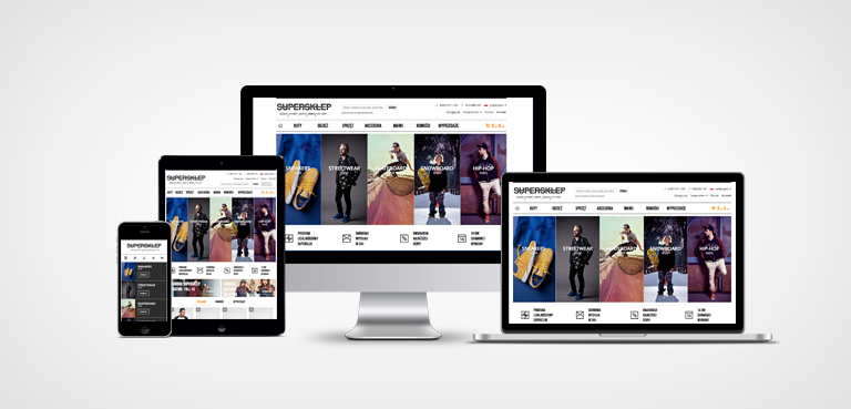
Adapting to fast changing consumer behaviour is a major challenge for eCommerce. This behaviour increseas its mobility. Therefore, all our eCommerce systems are developed according to a responsive web design.
Mobile buy more
Polish eCommerce traffic from mobile devices oscillates between 7% and 15%. During promotional campaigns, it reach up to 30%. Responsive web design is the ideal solution to increase the conversion of mobile purchases. Consumer research conducted among online shoppers shows very clearly that the mobile channel should take into account the company's development strategy and sales. Studies have shown that the same value of purchases made from mobile devices is greater than in the case of desktop purchases. Tablet has been leading the way, the value of purchases using this device can be increased even by up to 20% as compared to the value of desktop purchases.
Mobile users treat tablets and smartphones as the first devices to search for information on the network. Also, to search for information about products and services. This information is often checked on the sites of manufacturers and distributors. According to a survey conducted by GfK Polonia, as ordered by i-systems, up to 95% of Internet users visiting the website of manufacturers would like to have an opportunity to buy selected products. Online stores and responsive web design solutions greatly simplify purchasing decisions in this regard.
The history of responsive web design in Poland
In mid 2012, we launched the first in Poland large and complete online store in responsive web design. Since then, our UX and frontend teams have been developing eCommerce solutions in this design. Such a large and increasingly growing role of mobile in eCommerce meant that, from 2013, all the projects we create have been based on the solution of responsive web design. This is the future of eCommerce.
We are future ready
Planning responsive web layout begins with the principle of mobile first. Optimizing the distribution of content in the smallest resolution results in clarity and functionality in larger work surfaces. The same principle governs our development work where interpretation and inheritance of styles is performed using the cascade method. Using the assumptions of responsive web design during the design and implementation of eCommerce systems we create solutions ready for future eCommerce environment changes.